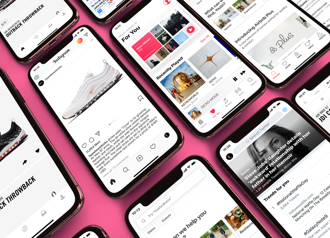
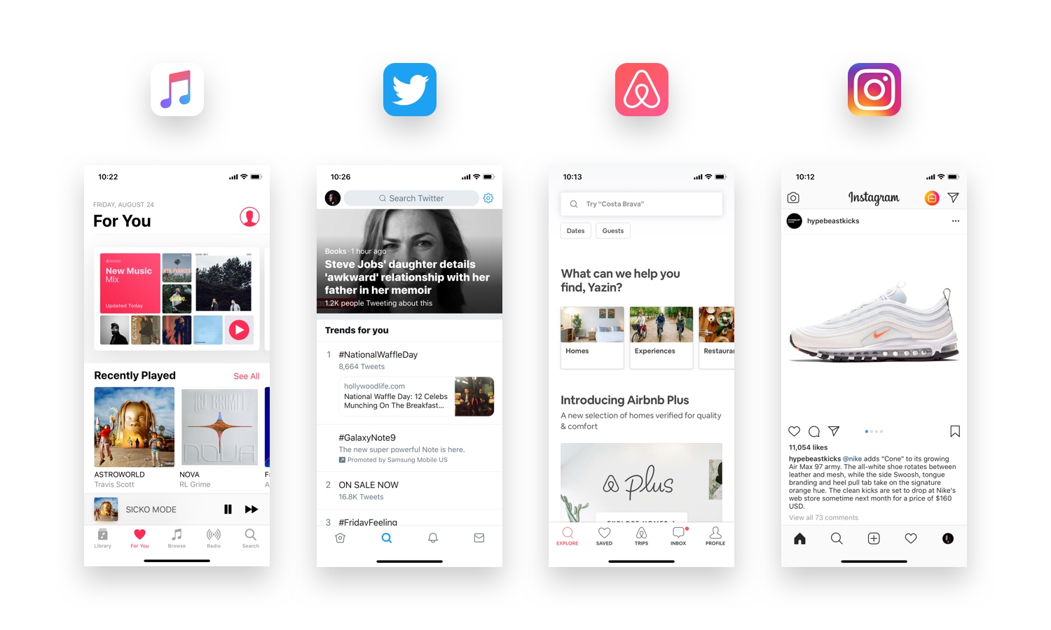
So what is exactly is going on?
Well, I’d argue that the uniformity in product design is a good thing. And here’s a few reasons why.
More Focus On Content and Outcomes
App fatigue is a real thing. Most people have grown tired of bouncing between too many apps or learning how to use a new interface after every new download.
Close to a quarter of all downloaded apps are deleted after just one use. Research shows that most people have just a few apps they use on a regular basis — apps that save time or money (or both) and make life easier. With uniformity across everyday digital products, designers can put more focus on doing exactly that.
As Don Norman — known for coining the term “UX” — said it best, “The real problem with the interface is that it is an interface. Interfaces get in the way. I don’t want to focus my energies on an interface. I want to focus on the job.”
More Consistency Means Better Usability
When was the last time you tried to buy something online and didn’t immediately scan the top right of your screen to get to your shopping cart? The standardized design conventions of nearly all e-commerce sites mean people don’t need to relearn how to shop at every online store.
Anything that is a convention on a majority of apps will be burned into most people’s brains and deviation, unfortunately, causes confusion and frustration.
Take Snapchat, for instance, which released a controversial design update earlier this year. The unconventional design — which included jumbling features and changing the navigation patterns — caused user sentiment to drop 73 percent almost immediately, and the app’s user count and the share price fell way down.
Designing something novel is risky, as Snapchat proved, but consistent design (even among competitor apps) can reduce the likelihood of upsetting your users.
Branding Isn’t Just How It Looks, but How It Works
Reconciling a user’s needs and intentions with a solution is where great experiences are derived. A differentiated experience is intangible and arguably much more valuable to a brand than a differentiated look and feel.
Granted, style is important, and it can also play a big role in the experience. People are more tolerant and forgiving of a confusing interface when they find it visually appealing.
But a designer’s energy should be spent on creating the best possible way that someone can complete a task, not finessing color palettes or dramatic animations. Designing something well, something valuable to the end-user, requires a seemingly infinite cycle of testing and iterating designs to get closer to what is useful and usable.
Barack Obama, Steve Jobs, Mark Zuckerberg; they’re all famous for wearing the same outfits everyday. The reason is what psychologists call decision fatigue. They have to make tons of decisions each day with a finite amount of energy, and limiting the minutiae of decisions like what to wear preserves the energy for the real stuff.
Designers should think about their energy the same way. With interface designs trending towards consolidation, designers can spend less time worrying about what color or how big a button should be and more about why it should be there in the first place.
Sameness in Interface Design Does Not Stifle Creativity
Now, I know what you’re thinking — and yes, the downside to all of your favorite apps looking the same is that there will be less creativity and innovation. Which, honestly, I think is true.
But even if every product designer joins the movement for stripped-down interfaces, there’s still plenty of meaningful design work to be done.
In fact, the truth is, sameness in design is beneficial for the near-term (hopefully I’ve made the case for why), but they have even greater implications for the long-term.
For one, the rise in augmented reality and artificial intelligence, our interactions with computers will likely become more invisible; screens are shrinking, gestures are becoming more familiar, and we’re talking or chatting with screenless interfaces now more than ever.
Even on my iPhone, with it’s beautiful screen and interaction design, I usually opt for Siri for tasks like setting reminders, creating calendar events, choosing music, sending messages and checking the weather. I could probably get away with not using the screen all day without compromising any of the utility that my iPhone offers. Or, again, as Norman puts it, I can “get the job done.”
But yet, there’s so much work to be done for designers to improve Siri’s design. And I’m not the only UX Collective writer that thinks so. Kévin Eugène has an entire article about how to redesign the Siri experience.
That said, there will be even more opportunity to consider engaging the senses (beyond visuals), attention, emotions or perceptions in new, creative ways.
Limiting what we consider to be a good design to only what we see on a screen is, at a minimum, undermining the possibilities of what we might dream up for the future.
—
Originally published here.


